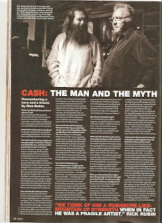

The choice of Johnny Cash featured in the article suggests that the target audience is aimed for men, 30-55 years old.
The type of language used in the article is informal
language, set out in a conversational tone with the use of humour from the
artist that makes it easy for the audience to understand and relate in a way.
Although there are a lot of pages used for the article, it seems to be a quick
read as the tone is very light-hearted and inviting, always making you read
more.
The style of the article matches the style of the front
cover of the magazine showing that there is a house style within the magazine.
It uses the theme of red, black and white throughout the article which could
represent the artist not being alive and using this article to pay a tribute
towards him because the colours are mainly worn in a funeral. Also these
colours red, black and white are colours that represent the genre of rock,
which is the genre that Johnny Cash expanded on from country music.
The layout is set out with the questions at the top and the
answer the artist has given at the bottom-in columns. The article is very
personal as it tells you more in depth about his life and the struggles, he
uses phrases such as ‘we were all doing the devil’s work’ giving you a raw
image about him because of his honesty towards the audience.
The colours used represent the overall tone of the article;
in the first pages it uses black and white and coloured images in order to
represent the childhood and beginnings of his life with the happy and humorous
events that took place. In the next pages, it focuses on his death and the
legacy he left behind with an interview from a friend who speaks about him and
give you a sort of behind the scenes story in terms of the music they produced
and how he was without the camera “we think of him a Rushmore-like-mountain
when in fact he was a fragile artist”. This part of the article uses a lot of
dark, black, shadowing colours representing his death and makes this article
stand out from the rest as it sort of feels like they are trying to bring the
artist back to life.
The style of text used is a simplistic and readable font
that suits its target audience of 30-55 years old as the article mainly
composes of text in comparison to images. This target audience would mainly
like to read compared to other audiences who like to see it better in pictures,
the tone the magazine uses when addressing the reader is as a close friend, who
seems to know a lot about Johnny Cash’s life as he tells it all.
The artist is presented to the audience as an icon and music
legend; there are images of him with other notable artists such as Elvis
Presley showing his influence over them. The article is very positive as it
seems to be showing a tribute towards the artist, highlighting the fact that he
was able to get through the hard times (drugs) and the way he got over these.
It also makes him a role model, as you are able to see the struggles and pain he
went through yet becoming a good person at the end of it all.
The article demands prior knowledge when reading the article
as you would have to know about Johnny Cash; the interviewer begins with ‘his
physical frailty came as a shock, just as it did in the Hurt video’ this shows
that they would have to be an informed fan of the artist in order to understand
the article as throughout the article, there are many references to his music,
family and career overall.
No comments:
Post a Comment