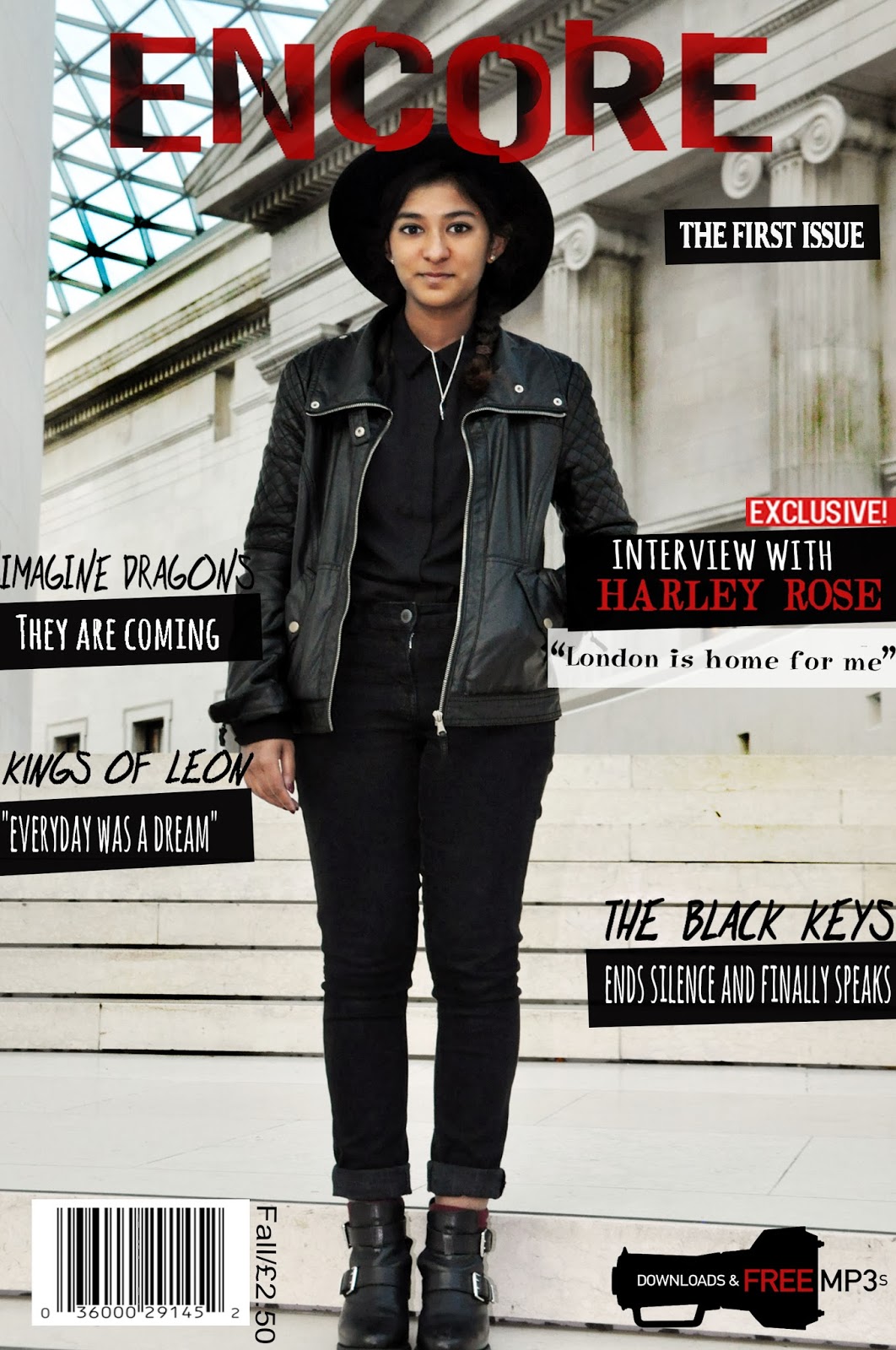
Monday 30 September 2013

Sunday 29 September 2013

Editing of Chosen Images (Front Cover & Article Pages)

This is the evidence showing how I have edited the images for my front cover and article pages
Used the auto contrast tool to automatically change the contrast that fits the image

 Used a burn tool in order to make the background dirtier as it looks too clean and also to suit the genre of the magazine.
Changed the size of the brush and making it bigger in order to save time as a bigger brush covers a larger part of the image.
This is the final product of my image after editing 
I used the magic wand tool to remove the background
Using the quick selection tool to get rid of the rest of the background
After the background is fully removed, I will be using the paint bucket tool to colour the background in white
This is the final product of my image after editing

Saturday 28 September 2013

Front Cover Chosen Images


 I have chosen these images as I felt that this best represented my artist as I hope to be able to challenge some of the stereotypes of rock artists, these images show my artist as down to earth and friendly. It shows her strong and independent for the front cover, but cheerful and young in the article pages showing the contrast and dimensions within her personality. I felt that a range of expressions and feelings in the images from the artist would be able to help my readers to understand and get to know my artist better.


Friday 27 September 2013

All photographs taken for Front Cover & Article Pages

These are evidence of the photographs taken for the front cover and article of my magazine.

Wednesday 25 September 2013

Improved draft of pages (with internet images)

These are the improved draft pages of the music magazine with the use of internet images

Peer Assessment of pages

This is my peer assessment results, it shows the areas where I need to improve on in my front cover and contents page. 


Tuesday 24 September 2013

Original article draft and article pages with internet found images

This is the article draft using internet images 
Pandemonium’s Fire
She is the 18 year old up and coming solo singer from her number one album Pandemonium born and raised in the bay area of San Francisco but currently resides in London. She was approached by her current record label Interscope Records at the age of 17 when they found her busking on the streets outside a Starbucks with a cardboard sign displaying the message that she needed money for a bus ride home. As we enter the her studio apartment we immediately hear the screams and laughs of girls having a blast and enjoying their time, almost hard to believe that its coming from an artist that has had a chart topping success in most of the songs released this year.  As we approach inside the apartment, we are immediately met with Harley Rose, an image completely changed from the strong all black wearing girl in the photo shoot. Instead we are with an average teen wearing ‘sweats’ as she likes to call it ,looking very comfortable and cosy for the fall season.
So how is life different from here in London to the bay area?
Well, the bay area is very sunny… sunny spells all the way! (laughs) but British weather is so insane! You get the sun… and the rain, you get clouds of doom and rain would find its way here (laughs) But you know it’s great, in a way that its different. I mean I’ve come to find a way to make peace with the rain, and as of now London is home for me.
It seems that you have made friends (looks towards them). Have they inspired you in any way towards your music?
Of course, definitely. I mean I am thankful for these girls because they seem to tolerate me, especially with my American attitude towards things, you know everything in London is definitely smaller and cosier I should say. In terms of music, they have definitely inspired me as the stories behind my songs and music are not always about me but about other people as well. I believe that it helps to keep my music relatable and that’s what music is about, sharing people’s experiences and stories to the world. It’s a form of art.
How did you feel when your debut song  Calamity topped the UK Charts?
We were in a daze where you feel alive cause your walking fine and people are seeing you, but inside we felt like a bubble about to burst and fly away into space. (Laughing) It sounds like I’m on drugs but that is the only way I can do justice in describing it. Maybe it’s like mothers when they give birth, it was hard work but once you see that little baby everything feels all right with the world. In a state of Euphoria maybe? Funny thing is that the first thing we did to ‘celebrate’ was to call the local pizza shop and told them who I was and that my song is number one right now, and they were like of course, my song’s number one too (laughing). They didn’t believe us for a second.
Why have you chosen to call your debut album ‘Pandemonium’?
Normally, for an artist it would be a self-title album with their name or something. But I felt that this is the album that shows the beginning of my career in music, so why not call it something that is just out of this world or memorable I should say? Pandemonium means creating wars, disorder and chaos; I just felt that my entrance into this industry should be loud and chaotic, almost as if I’m telling the world ‘Hey! There’s a 17 year old girl who would like for you to listen to her songs’ (laughs)
I know you write songs, and your debut album is self-composed. How does it feel knowing that your own written songs have topped most music charts worldwide?
I mean yeah, it’s surreal and most of the time I feel like I’m dreaming. You know it’s hard to believe my achievements, I mean now I can actually go tell people that I wrote the song that’s currently number one right now, not a lot of eighteen year olds can actually say that.
Now, how has the success been for you?
I’m gonna be honest with you, it has changed me. Fame has changed me. I always used to look up to those artists you know, thinking they had the best job in the world because they would sing in front of thousands of people who love their songs and create that connection with them. But I realised that it wasn’t all that, because that was just the front of it all. There were producers, managers and the label to impress, you couldn’t just play any music you wanted to- you had to get the permission to do it. I mean, I feel that I learnt it the hard way, because I was so persistent in what I wanted that everything would end up being back to square one and the same thing would happen all over again. But it turned out to be a part of our label’s big plan for me, training me to be able to face the world and being able to live under the pressure of this business and still keeping the you intact. It has helped me to mature. But at the end of the day I’m just a kid having the time of her life.
Do people treat you differently?
If by people you mean my family, NO. They still order me around the house when I visit home, one time I was really lazy and woke up late and I remember my mum saying to me “I know you may have a number one song right now, but it doesn’t mean anything different in this household. I’m number one around here” (laughs). I do get free food from time to time, the fans are increasingly getting larger and more people are spotting me from the streets. Some of those in the older generation are kind of shock to think that I’m famous because their grandchildren would want pictures with me and they would be ‘I don’t know who you are, but during my time we wouldn’t see Michael Jackson on the streets”.
Any plans for a new album?
My debut album is currently being promoted right now so my focus would be on that, but I will be returning to the studio in the New Year to get creative again. You know I feel that’s the best part about being an artist, the creative process.                                                                                                
Any upcoming world tours?
Yes! It’s in the making and I don’t think I should be saying this (laughs). but let’s just say it’s a world exclusive right? I am so excited for this, there are plans of it happening and I just can’t wait to meet all o the fans. It will definitely be happening sometime next year, let’s just cross our fingers its sooner.
What can we expect from Harley Rose in the future?
Currently, I am busy promoting my debut album Pandemonium but I will be back in the studio in no time. There are already plans and ideas for the next album, so things should get exciting soon. I am currently working on a secret project (winks) and I can’t tell you anymore or they’ll tell me off! I’ve already said too much (laughing)
Any hints on this secret project?

I have a feeling this will be first and last solo interview. You guys keep on making me spill things (laughing). But I think… I think I should be able to say that it’s a collab? Maybe? Maybe not? (laughing) Who knows, I didn’t say anything. 

Monday 23 September 2013

Mock up of cover, contents (with internet images)


This is the mock up front cover 

                                                       This is the mock up contents page 

Sunday 22 September 2013

Front Cover Analysis

Mojo, is a music magazine that mainly features the genre classic rock. Through the front cover, we are clearly able to see that it focuses on classic rock icons that were known purely for their music as one puff says ‘manufactured pop music is sinful!’

The target audience for this magazine is 30-55 years old, with particular interests listening to music that is meaningful and pleasant to hear.

The central image uses an indirect mode of address where the main cover artist- Johnny Cash seems to be looking away from the camera instead of directly at it. This tells you that the relationship the magazine wishes to have with the reader is to be an informer, who would just be able to inform you news on these artists compared to having a close and personal relationship. The body language shows a dominant and superior image towards the audience, which can be referred to his ‘legend’ status. Apart from having this title, he is also known as ‘The Man in Black’ showing you the reason why he is dressed in all black. The background shows that he is in a field of flowers, representing his death and the possibility of this being heaven. The fact that he is clearly dominating over this ‘field of flowers’ gives you the idea of him being dominant even in heaven, showing you his legend status once again.

The artist on the main front cover is Johnny Cash, a well-known country singer who is considered to be one of the most influential musicians of the 20th century. This would be reason on why he was chosen to be that artist on the main cover for the magazines special anniversary edition issue as his reputation is the type of image, a magazine would wish to present on their anniversary edition-iconic.

The anchorage text says ‘CASH, THE BIRTH OF THE LEGEND & HIS LAST DECADE’, by only having his surname used to advertise him shows the type of icon he is in the music industry and how well-known he is as only using a surname or one word for the artist indicates the height of their status and popularity an example for this would be Madonna, Beyonce and Elvis who are all well-known singers just from their first or last name. Being nicknamed as a ‘legend’ shows the impact he has over the music industry, as not every artist is called a legend. We are clearly able to identify through the anchorage text that this artist is already dead yet he is still remembered in this way and having been on the main cover for a special issue indicates his legacy and what he left behind, having not been forgotten. It also tells you what type of article to expect from the anchorage text, which shows that it would mainly cover his life and the highlights of it all, into becoming one of music’s icon.

The design of the title block is very simple, big and old style in terms of using shadowing effect on its font. The use of shadowing could tell you that they feature artists who are the backbone and shadows of the music world as they have all come and gone.

The title ‘mojo’ means a magic charm or magic power. The style of the magazine tells you through this that it would mainly focus on artists who have made it big and became iconic through time as they are artists who have accumulated these ‘magic charms or powers’ to draw its audience and fans. The image the title gives you seems to be very mysterious and makes the audience curious, especially because the magazine covers artist who are dead and alive, it would it unpredictable for the audience to know who would be on the cover for the next issue, which could indicate is one of the unique charms of this magazine as other music magazines mainly focus on artists right now.

The puffs ‘there was unfinished business…’ suggests you inside scoop on these artists, that may relate to the reader in a personal level especially with ‘manufactured pop music is sinful!’ as it gives the artists opinions on current events such as the use of auto-tune. This tells you that the type of audience the magazine wishes to get are those who love classic rock music, old school style. The type of music where you are able to feel the hard work and time it took in order to make this,  a big comparison to music produced nowadays in this internet-era.

The colours used are mainly black, white and red. I found the colours attractive as it is very old-school black and white back to basics theme for a magazine. It uses red, which a pop of colour that can be found from a far distance and the use of black and white contrasts to the neon and bright colours that are used in other magazines today, making this magazine only appeal towards its readers easily and clearly. The fonts used are very simple, white and red bold and capitalised fonts that is readable and directly appeals towards its audience of 30-55 years old.


The strategy used to attract the audience is the addition of a cover mount, having this attracts the readers who are fans of the main cover artist who would wish to receive an album of their greatest hits. They use a variety of artists who are very well-known that younger generations would have heard their names; this is the magazines strong point as they know that they will never run out of an audience as they mainly feature the royalties and changers of the music industry. 

Moodboard Analysis

Saturday 21 September 2013

Title Block Poll Response

The poll results show that the title block they liked best was number 1 which is the title block shown below. This would mean that this is the title block I will be using for my magazine cover. 


Friday 20 September 2013

Potential Designs for my Title Block

These are the potential designs for my title block and I will be choosing them according to which font is voted the highest in my poll

1


2

3

Tuesday 17 September 2013

Evolution of Taylor Swift (Star Image Analysis)


This shows the evolution of Taylor Swift and how she is represented differently according to the type of magazine it is and its target audience. This analysis would help me to construct my cover star for my own magazine as I am able to see how the cover artist is represented which would help me to know what I would like for my cover artist to be portrayed which would differ depending on my target audience. 


Denotation (what you can see)
Connotation
Setting/Location: white background

This would be used in order for the artist to stand out more.
Body Language/Facial Expressions: she is sitting down looking straight at the camera, at a side angle. With one hand holding her hair, in order to not cover her face and the other in between her legs. Her legs are angled sideways showing her bare legs as it’s crossed over.
The facial expression shows direct mode of address, looking like she doesn’t care making her seem like a rebel. This could be used as a stereotype towards teenagers, who are very mysterious and secretive in what they do especially with how she is positioned.
Costume/Props: Very thick, smudged black eyeliner and black and gold sports jacket

The costume tells a story within the image, as the jacket laid over her shoulders are what sports students usually wear in American high school films, typically named as the ‘jocks- who are represented as the popular kids. Taylor swift’s makeup seems to be run down, possibly indicating that the scene could be from a late night party.
Camera Shot: medium long shot
Used in order to see the character in their setting
Lighting: high key lighting

The effects of the high key lighting on  Taylor Swift shows that she may be tired of the spotlight being  on her all the time as she seems to just stare directly at the camera with an expression that she is bored.
Anchorage text: ‘The heartbreak kid’

It reflects on the stereotyped idea of being dumped over a ‘popular boy’ with use of the jacket still draped over her, shows the lingering feelings she has over him. Her facial expression is also able to explain the mysteriousness of it through this text as you are able to see a hint of sadness within her expression.


Denotation (what you can see)
Connotation
Setting/Location: most of the front cover is taken up with the artists face-Taylor Swift
This shows a more intimate and close-up image of her as her raw emotions are clearly seen in the image.
Body Language/Facial Expressions: Blue-grey eyes, staring straight at the camera with her lips slightly open to show her teeth and a strand of hair covering her lips.
The facial expression shows she is very scared and is almost at breaking point, where she could break down to tears especially with her eyes in the colour of blue and grey it reflects her emotions as blue and grey tend to represent sad and stoic feelings, almost as if she is numb and the only gateway to see her emotions is through her eyes thus the quote ‘eyes are the gateway to the soul’.
Costume/Props: seems to be wearing a white turtleneck shirt.

This would show that she is not comfortable with herself as she is covered up. It could also mean that she is defending herself, as various forms of defence is by wearing layers of clothing in order to feel safer.
Camera Shot: Close up shot
To show facial expression and emotion, able to give a sense of vulnerability to the audience.
Lighting: high key lighting

High key lighting to clearly see the details of her face also showing her flaws as some may see her as perfect.
Anchorage text: ‘New look & love’

The image shows her physical change, from being a curly haired artist to being straight haired, this could be her way of showing her new self, having gotten over her old love and finding a new one with the scars of the old still present within her as you can see in the frailness of her eyes.


Denotation (what you can see)
Connotation
Setting/Location: on a light and dark grey rooftop
In order to connect with her position as an artist as she has become very successful over the years.
Body Language/Facial Expressions: looking straight at the camera with twinkling eyes, lips slightly open to show her teeth and face angled straight towards the camera, hands stretched and laid on top of each other, on top of her lap.
The magazine represents her as a typical ‘dumb blonde’, with her expression looking guilty and coy by acting modest as her hands are laid on top of her lap but also teasing you through this as she seems to not be doing this seriously.
Costume/Props: Gold, glitter embellished dress with red belt and red poufy garment and red nails. Her hair is loosely curled with lots of volume giving a messy yet neat effect.

This shows Taylor Swift as youthful and charming by appealing to younger audiences and also flirtatious as her dress is very princess styled. Her look seems to give off a fairytale theme especially with the gold glitter dress which is very bright and something that makes her stand out of the crowd. This could also represent her as a youthful artist that continues to shine.
Camera Shot: Close up shot
To show facial expression and emotion, able to give a sense of vulnerability to the audience.
Lighting: artificial lighting

Used to create a dream-like image of her, that kind of looks like a Barbie doll. Clearly appealing to the younger audiences.
Anchorage text: ‘Stuff she only tells her girlfriends’

The anchorage text very much represents her facial expression as she seems to be guilty of something and is trying to gossip or let you in on a secret.


Denotation (what you can see)
Connotation
Setting/Location: plain grey background
This would be used in order for the artist to stand out more and also indicates that the image constructed was a studio shoot.
Body Language/Facial Expressions: Eyes looking straight at the camera, with her hands at the side, hips slightly swayed to the side standing straight.
Her body language is very confident and comfortable especially with her hands at the side; it shows that she is content with how she is through her facial expression.
Costume/Props: gold and black patterned dress

The colour is toned down, as the addition of black makes her look older and more sophisticated. This could represent the idea of her coming out of age from being a young star to being taken more seriously as a woman.
Camera Shot: Taken at a slight low angle
You are able to see the body language of the artist, being able to see more clearly what they are trying to portray. The low angle makes the artist bigger than the audience, showing the higher status of Taylor Swift in comparison to the audience.
Lighting: natural lighting

High angle lighting, mainly highlighting her face.
Anchorage text: ‘Taylor Swift wears Gucci, fashion’s newest golden girl’

This shows her change on becoming a woman and growing up, especially with the use of ‘Taylor Swift wears Gucci’ not just represents her wearing a designer brand dress but being able to mature especially with her straight hair and fringed pulled back, she is shown as a more sophisticated woman


Monday 16 September 2013

Audience Questionnaire and results with comments

The results show that the most popular music genre people enjoy listening to are Rock, R&B and Indie, showing that maybe my magazine would focus on one of these genres.

 With the question above, the results shows that everyone would like to have an access to the magazine online. This shows that I would need to create a link between the magazine and online by directing my readers to the other online options by adding the website link.
The results show that most people would spend £1-£2 on a music magazine, indicating that this may be my price point for the magazine.

 The results show that 40% wanted the magazine to be weekly but 57% said that they would like for it to be monthly. This shows that the magazine could be issued every month.
The results above state that most people would like to read artist interviews in their magazine, while the  other options  of ‘gossip, exclusive interviews, behind the scenes and tour dates’ also came into consideration of what readers would like to read.   This shows that the magazine could incorporate a variety of these within the magazine in order to appeal to its audience.

The results show that the cover artist was the most popular in attracting the audience towards a magazine, while some said that freebies and cover mounts also attract them to this. This shows that my magazine would feature a main cover artist.

The results above show the options I have given the surveyors on what is the title they prefer most for a music magazine, the results showed that 85% picked the title ‘Encore’ which they thought best represented the name of a music magazine.

Focus Group

The video is from my focus group with the target audience, receiving feedback on what they think about the ideas for my magazine. It will help me in refining my initial planning as I will be able to see which ideas work and which ideas doesn't work through the feedback I receive. 


Saturday 14 September 2013

Analysis of Article Pages


The choice of Johnny Cash featured in the article suggests that the target audience is aimed for men, 30-55 years old.   

The type of language used in the article is informal language, set out in a conversational tone with the use of humour from the artist that makes it easy for the audience to understand and relate in a way. Although there are a lot of pages used for the article, it seems to be a quick read as the tone is very light-hearted and inviting, always making you read more.
The style of the article matches the style of the front cover of the magazine showing that there is a house style within the magazine. It uses the theme of red, black and white throughout the article which could represent the artist not being alive and using this article to pay a tribute towards him because the colours are mainly worn in a funeral. Also these colours red, black and white are colours that represent the genre of rock, which is the genre that Johnny Cash expanded on from country music.

The layout is set out with the questions at the top and the answer the artist has given at the bottom-in columns. The article is very personal as it tells you more in depth about his life and the struggles, he uses phrases such as ‘we were all doing the devil’s work’ giving you a raw image about him because of his honesty towards the audience.

The colours used represent the overall tone of the article; in the first pages it uses black and white and coloured images in order to represent the childhood and beginnings of his life with the happy and humorous events that took place. In the next pages, it focuses on his death and the legacy he left behind with an interview from a friend who speaks about him and give you a sort of behind the scenes story in terms of the music they produced and how he was without the camera “we think of him a Rushmore-like-mountain when in fact he was a fragile artist”. This part of the article uses a lot of dark, black, shadowing colours representing his death and makes this article stand out from the rest as it sort of feels like they are trying to bring the artist back to life. 

The style of text used is a simplistic and readable font that suits its target audience of 30-55 years old as the article mainly composes of text in comparison to images. This target audience would mainly like to read compared to other audiences who like to see it better in pictures, the tone the magazine uses when addressing the reader is as a close friend, who seems to know a lot about Johnny Cash’s life as he tells it all.  
The artist is presented to the audience as an icon and music legend; there are images of him with other notable artists such as Elvis Presley showing his influence over them. The article is very positive as it seems to be showing a tribute towards the artist, highlighting the fact that he was able to get through the hard times (drugs) and the way he got over these. It also makes him a role model, as you are able to see the struggles and pain he went through yet becoming a good person at the end of it all.

The article demands prior knowledge when reading the article as you would have to know about Johnny Cash; the interviewer begins with ‘his physical frailty came as a shock, just as it did in the Hurt video’ this shows that they would have to be an informed fan of the artist in order to understand the article as throughout the article, there are many references to his music, family and career overall.


Friday 13 September 2013

Analysis of Contents Page


The magazine uses a lot of images, especially overlapping images that makes it easier for the reader to visualise and have an idea on what the magazine would be about.
The features contents page uses the same colour and font for the title ‘contents’ to the title block on the front cover, there is a distinct use of a house style that you are able to notice straight away as both the front cover and contents page uses the colours-red, black and white. The moment you open to the contents page, you are able to see a close-up shot of its artist; in this case it is Janelle Monae. This is a distinctive feature used in their contents page as they frequently have close-up to mid-shots of artists in their contents page. The colours used are very strong and striking giving the effect that the audience would never be able to skip through the contents page without looking at it. They use a feature of having a sub-title underneath the title ‘contents’ with the labels ‘LONDON. MEMPHIS. HENDERSONVILLE’, this creates a personal touch for the reader as London and Memphis represents the home of the magazine, while Hendersonville represents the home of the main cover artist-Johnny Cash. This gives an effect of the reader being an informed fan who knows a lot about the main cover artist because an average reader wouldn’t understand the relevance of this.
There is a clear red line that tells you the issue number and date, allowing the reader and magazine publisher to know what issue it is easily. The titles are easily seen and the main features easily identifiable in terms of the articles and cover story, the featured article are clearly written in bold and capital with a slight preview of the article on what the reader should be expecting to find out, they have made it easy for the reader to navigate through the contents page.
The image used on the feature contents page uses a dark red background similar to her red glossy lips. This adds a feminine touch to her masculine-like clothing with the checkered print black and white blazer, white shirt and bowler hat. The promotional features of the magazine include the new releases of albums to help promote them.
The information is organised in a way that makes it easier for the audience to navigate around the magazine as the contents page lays it out with the features page at the first page and the other sections in the second page. This makes it easier for the reader as the reader would immediately know which page the feature article is located at, which is mostly what the audience reads. They also use sub-headings such as Regulars, What goes on! And Mojo Filter that features new albums released by artists that has genres that the targeted audience for the magazine would like, this also creates an interaction between the magazine and reader as being able to exchange musical recommendations with each other creating that connection with the reader as it makes the magazine more of a friend than a stranger.  
The magazine logo is featured on the second page of the contents page makes the logo dominant enough for the reader to know which magazine it is, although the brand has its other franchises-sister magazine Q, it doesn’t advertise this magazine within Mojo showing the differences in genre between the magazines or the way the company promotes their magazines. The magazine mostly promotes its own magazine with deals on subscribing to their issues or special prices given to the readers for this month.


Thursday 12 September 2013

Analysis of two magazine front covers

This magazine is a music magazine, the issues and articles that are going to be inside are music related articles.
The target audience are men and women aged between 19-45 as it covers a vast variety of music genres that appeals to most styles and ages. The interests of this age group would be supporting their favourite artists by buying merchandise and records.
The magazine uses a direct mode of address; this tells you that the magazine wishes to have a personal relationship with its reader. The artist on the main front cover is Bruno Mars, as he is one of the most popular artists today; also he has had a huge number of hits that would reflect on why he is the main cover for the 50 years special edition of the magazine.
The anchorage text is ‘Bruno Mars IS BIG BUSINESS’, implying that the artist is somewhat valuable or contributes towards the music industry. The overall message the artist is giving is a relatable image, by showing confidence in his body language yet a shy facial expression. The look and feel the artist gives you, is a very nostalgic feeling with the use of black and white effect and gelled back hair most famously worn by Elvis. You could say that Bruno Mars is doing a tribute towards the artists who have made an impact in the last 50 years.
The buzz words used is ‘big’, the meaning of this is through his popularity and being known worldwide, having an effect on the reader by attracting them to buy the magazine.
The design of the title block is a white simple font with the colours- red, yellow, blue, green on the circles of the font that make ‘billboard’ this would be able to tell you that the magazine explores different genres instead of sticking to one main genre, with the use of having different colours to represent this. The white font shows simplicity and sophistication that is typical of an established successful magazine.
The title of the magazine tells you about its image of having a variety of music that appeals to everyone, indicating that this could be pop music as a billboard usually represent something high and easily seen by everyone. This could show that the music the magazine mainly focuses on is music that is popular and artists that everyone’s talking about.
The puff suggests that other famous and respected artists will also be featured in the magazine such as Mariah Carey, Elton John and Whitney Houston. This tells you that the magazine doesn’t solely focus on the artist on the main cover, but also focuses on a wide variety of them.
The slogan is ‘The adult contemporary chart celebrates’ this helps to attract readers as it is clearly shown on what type of target audience it aims for which are adults. The slogan also tells you about the magazine on their status within the print industry, that they are well-respected and known for the billboard chart which music artists aim to have their song on.
There are a lot of gold, black and white colours used throughout the main cover. This is used due to the magazine celebrating its 50 years into the industry. The colours are attractive as they are classic bold colours that would appeal to its readers, and they would be unique and easily spotted in shelves as other magazines in this time, uses bright colours and images. The fonts used are a very simplistic and readable font.
The strategies the magazine used to attract the audience is by having Bruno Mars-a famous artist of this generation be on the main cover and include puffs that highlight other famous and well-known artists we’ve had throughout the last 50 years. This would appeal to the audience as they have a wide range of artists that have different styles and were present in different times therefore attracting its audience.


Mojo, is a music magazine that mainly features the genre classic rock. Through the front cover, we are clearly able to see that it focuses on classic rock icons that were known purely for their music as one puff says ‘manufactured pop music is sinful!’

The target audience for this magazine is 30-55 years old, with particular interests listening to music that is meaningful and pleasant to hear.

The central image uses an indirect mode of address where the main cover artist- Johnny Cash seems to be looking away from the camera instead of directly at it. This tells you that the relationship the magazine wishes to have with the reader is to be an informer, who would just be able to inform you news on these artists compared to having a close and personal relationship. The body language shows a dominant and superior image towards the audience, which can be referred to his ‘legend’ status. Apart from having this title, he is also known as ‘The Man in Black’ showing you the reason why he is dressed in all black. The background shows that he is in a field of flowers, representing his death and the possibility of this being heaven. The fact that he is clearly dominating over this ‘field of flowers’ gives you the idea of him being dominant even in heaven, showing you his legend status once again.

The artist on the main front cover is Johnny Cash, a well-known country singer who is considered to be one of the most influential musicians of the 20th century. This would be reason on why he was chosen to be that artist on the main cover for the magazines special anniversary edition issue as his reputation is the type of image, a magazine would wish to present on their anniversary edition-iconic.

The anchorage text says ‘CASH, THE BIRTH OF THE LEGEND & HIS LAST DECADE’, by only having his surname used to advertise him shows the type of icon he is in the music industry and how well-known he is as only using a surname or one word for the artist indicates the height of their status and popularity an example for this would be Madonna, Beyonce and Elvis who are all well-known singers just from their first or last name. Being nicknamed as a ‘legend’ shows the impact he has over the music industry, as not every artist is called a legend. We are clearly able to identify through the anchorage text that this artist is already dead yet he is still remembered in this way and having been on the main cover for a special issue indicates his legacy and what he left behind, having not been forgotten. It also tells you what type of article to expect from the anchorage text, which shows that it would mainly cover his life and the highlights of it all, into becoming one of music’s icon.

The design of the title block is very simple, big and old style in terms of using shadowing effect on its font. The use of shadowing could tell you that they feature artists who are the backbone and shadows of the music world as they have all come and gone.

The title ‘mojo’ means a magic charm or magic power. The style of the magazine tells you through this that it would mainly focus on artists who have made it big and became iconic through time as they are artists who have accumulated these ‘magic charms or powers’ to draw its audience and fans. The image the title gives you seems to be very mysterious and makes the audience curious, especially because the magazine covers artist who are dead and alive, it would it unpredictable for the audience to know who would be on the cover for the next issue, which could indicate is one of the unique charms of this magazine as other music magazines mainly focus on artists right now.

The puffs ‘there was unfinished business…’ suggests you inside scoop on these artists, that may relate to the reader in a personal level especially with ‘manufactured pop music is sinful!’ as it gives the artists opinions on current events such as the use of auto-tune. This tells you that the type of audience the magazine wishes to get are those who love classic rock music, old school style. The type of music where you are able to feel the hard work and time it took in order to make this,  a big comparison to music produced nowadays in this internet-era.

The colours used are mainly black, white and red. I found the colours attractive as it is very old-school black and white back to basics theme for a magazine. It uses red, which a pop of colour that can be found from a far distance and the use of black and white contrasts to the neon and bright colours that are used in other magazines today, making this magazine only appeal towards its readers easily and clearly. The fonts used are very simple, white and red bold and capitalised fonts that is readable and directly appeals towards its audience of 30-55 years old.


The strategy used to attract the audience is the addition of a cover mount, having this attracts the readers who are fans of the main cover artist who would wish to receive an album of their greatest hits. They use a variety of artists who are very well-known that younger generations would have heard their names; this is the magazines strong point as they know that they will never run out of an audience as they mainly feature the royalties and changers of the music industry.