This is my evaluation for my music magazine
How my magazine develop, use or challenge forms and conventions of existing magazines
Thursday, 27 February 2014

Thursday, 23 January 2014
Final Cover, Contents Page & Double Page Article
This is my final cover, contents page and double page article of my music magazine


Thursday, 19 December 2013


Thursday, 3 October 2013

Wednesday, 2 October 2013
Editing of Chosen Images (Contents Page)
This is evidence showing how I have edited my images and the tools that I have used


Afterwards, I cropped the image in order to get rid of unwanted parts of the image and to make the image more compact to fit into my contents page.

For this image, I am going to add a filter and to make it represent the genre of my magazine I have chosen to add a black and white filter to the image

After the filter is added into the photo, you can see that I am able to adjust how dark or light the black and white filter is. Also, you are able to change which areas you would wish to be darker than others

I have adjusted the light settings and you can see that in some areas the lighting is brighter than others. This is the final product of my image.
Tuesday, 1 October 2013
Photographs for Contents Page, final chosen photographs
These are the images that I have taken for my contents page


Monday, 30 September 2013
1st draft of Front Cover and Article Pages
This is the first draft of the front cover and article pages
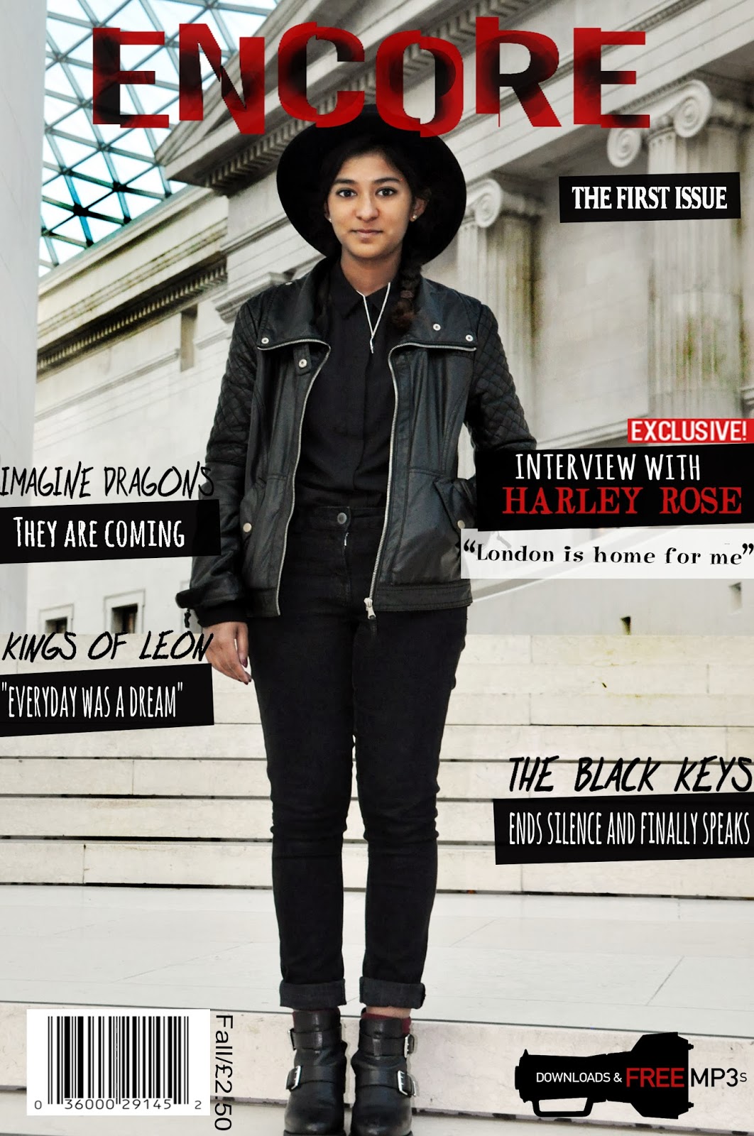


Sunday, 29 September 2013
Editing of Chosen Images (Front Cover & Article Pages)
This is the evidence showing how I have edited the images for my front cover and article pages

Used the auto contrast tool to automatically change the contrast that fits the image


Changed the size of the brush and making it bigger in order to save time as a bigger brush covers a larger part of the image.

This is the final product of my image after editing


Saturday, 28 September 2013
Front Cover Chosen Images
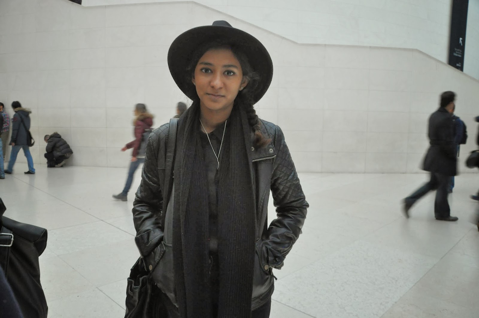

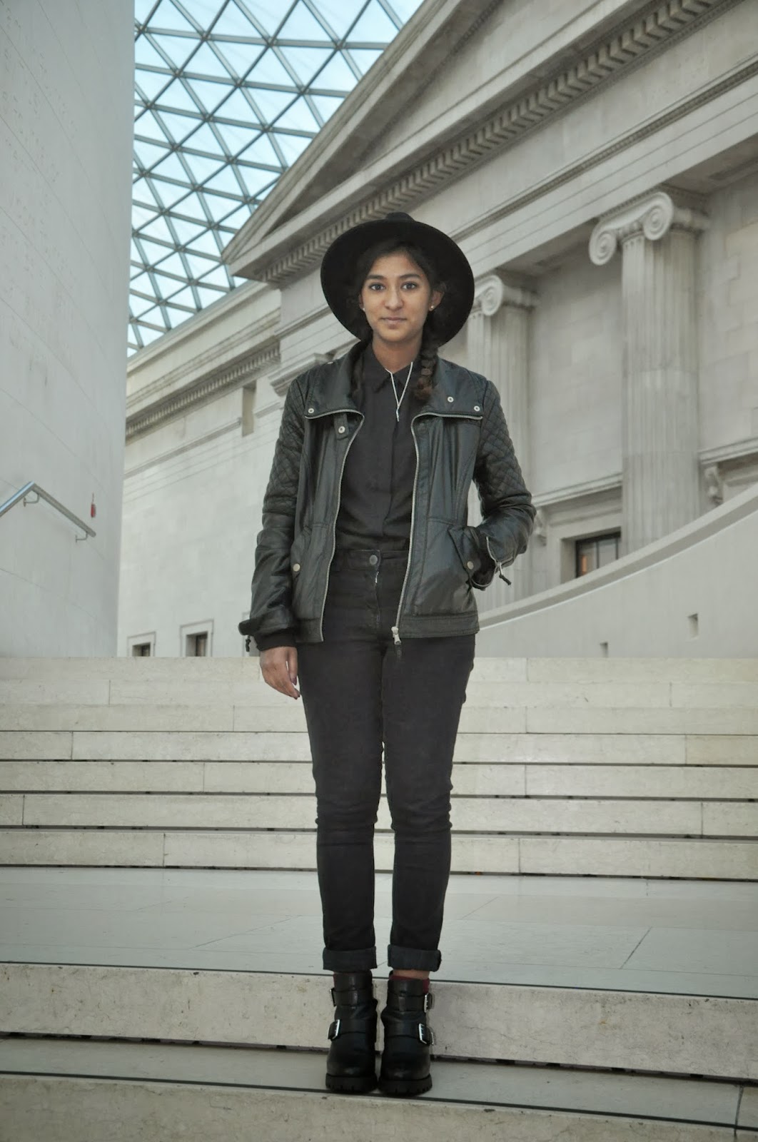
I have chosen these images as I felt that this best represented my artist as I hope to be able to challenge some of the stereotypes of rock artists, these images show my artist as down to earth and friendly. It shows her strong and independent for the front cover, but cheerful and young in the article pages showing the contrast and dimensions within her personality. I felt that a range of expressions and feelings in the images from the artist would be able to help my readers to understand and get to know my artist better.
Friday, 27 September 2013
All photographs taken for Front Cover & Article Pages

Thursday, 26 September 2013
Wednesday, 25 September 2013
Improved draft of pages (with internet images)
These are the improved draft pages of the music magazine with the use of internet images


Peer Assessment of pages
This is my peer assessment results, it shows the areas where I need to improve on in my front cover and contents page.

Tuesday, 24 September 2013
Original article draft and article pages with internet found images
This is the article draft using internet images

Pandemonium’s Fire
She is the 18 year old up
and coming solo singer from her number one album Pandemonium born and raised in
the bay area of San Francisco but currently resides in London. She was
approached by her current record label Interscope Records at the age of 17 when
they found her busking on the streets outside a Starbucks with a cardboard sign
displaying the message that she needed money for a bus ride home. As we enter
the her studio apartment we immediately hear the screams and laughs of girls
having a blast and enjoying their time, almost hard to believe that its coming
from an artist that has had a chart topping success in most of the songs
released this year. As we approach
inside the apartment, we are immediately met with Harley Rose, an image
completely changed from the strong all black wearing girl in the photo shoot.
Instead we are with an average teen wearing ‘sweats’ as she likes to call it
,looking very comfortable and cosy for the fall season.
So how is life different from here
in London to the bay area?
Well, the bay area is very
sunny… sunny spells all the way! (laughs) but British weather is so insane! You
get the sun… and the rain, you get clouds of doom and rain would find its way
here (laughs) But you know it’s great, in a way that its different. I mean I’ve
come to find a way to make peace with the rain, and as of now London is home
for me.
It seems that you have made
friends (looks towards them). Have they inspired you in any way towards your
music?
Of course, definitely. I
mean I am thankful for these girls because they seem to tolerate me, especially
with my American attitude towards things, you know everything in London is
definitely smaller and cosier I should say. In terms of music, they have
definitely inspired me as the stories behind my songs and music are not always
about me but about other people as well. I believe that it helps to keep my
music relatable and that’s what music is about, sharing people’s experiences
and stories to the world. It’s a form of art.
How did you feel when your debut
song Calamity topped the UK Charts?
We were in a daze where
you feel alive cause your walking fine and people are seeing you, but inside we
felt like a bubble about to burst and fly away into space. (Laughing) It sounds
like I’m on drugs but that is the only way I can do justice in describing it.
Maybe it’s like mothers when they give birth, it was hard work but once you see
that little baby everything feels all right with the world. In a state of
Euphoria maybe? Funny thing is that the first thing we did to ‘celebrate’ was
to call the local pizza shop and told them who I was and that my song is number
one right now, and they were like of course, my song’s number one too
(laughing). They didn’t believe us for a second.
Why have you chosen to call your
debut album ‘Pandemonium’?
Normally, for an artist it
would be a self-title album with their name or something. But I felt that this
is the album that shows the beginning of my career in music, so why not call it
something that is just out of this world or memorable I should say? Pandemonium
means creating wars, disorder and chaos; I just felt that my entrance into this
industry should be loud and chaotic, almost as if I’m telling the world ‘Hey!
There’s a 17 year old girl who would like for you to listen to her songs’ (laughs)
I know you write songs, and your
debut album is self-composed. How does it feel knowing that your own written
songs have topped most music charts worldwide?
I mean yeah, it’s surreal
and most of the time I feel like I’m dreaming. You know it’s hard to believe my
achievements, I mean now I can actually go tell people that I wrote the song
that’s currently number one right now, not a lot of eighteen year olds can
actually say that.
Now, how has the success been for
you?
I’m gonna be honest with
you, it has changed me. Fame has changed me. I always used to look up to those
artists you know, thinking they had the best job in the world because they
would sing in front of thousands of people who love their songs and create that
connection with them. But I realised that it wasn’t all that, because that was
just the front of it all. There were producers, managers and the label to
impress, you couldn’t just play any music you wanted to- you had to get the
permission to do it. I mean, I feel that I learnt it the hard way, because I
was so persistent in what I wanted that everything would end up being back to
square one and the same thing would happen all over again. But it turned out to
be a part of our label’s big plan for me, training me to be able to face the
world and being able to live under the pressure of this business and still
keeping the you intact. It has helped
me to mature. But at the end of the day I’m just a kid having the time of her
life.
Do people treat you differently?
If by people you mean my
family, NO. They still order me around the house when I visit home, one time I
was really lazy and woke up late and I remember my mum saying to me “I know you
may have a number one song right now, but it doesn’t mean anything different in
this household. I’m number one around here” (laughs). I do get free food from
time to time, the fans are increasingly getting larger and more people are spotting
me from the streets. Some of those in the older generation are kind of shock to
think that I’m famous because their grandchildren would want pictures with me
and they would be ‘I don’t know who you are, but during my time we wouldn’t see
Michael Jackson on the streets”.
Any plans for a new album?
My debut album is
currently being promoted right now so my focus would be on that, but I will be
returning to the studio in the New Year to get creative again. You know I feel
that’s the best part about being an artist, the creative process.
Any upcoming world tours?
Yes! It’s in the making
and I don’t think I should be saying this (laughs). but let’s just say it’s a
world exclusive right? I am so excited for this, there are plans of it
happening and I just can’t wait to meet all o the fans. It will definitely be
happening sometime next year, let’s just cross our fingers its sooner.
What can we expect from Harley
Rose in the future?
Currently, I am busy
promoting my debut album Pandemonium but I will be back in the studio in no
time. There are already plans and ideas for the next album, so things should
get exciting soon. I am currently working on a secret project (winks) and I
can’t tell you anymore or they’ll tell me off! I’ve already said too much
(laughing)
Any hints on this secret project?
I have a feeling this will
be first and last solo interview. You guys keep on making me spill things
(laughing). But I think… I think I should be able to say that it’s a collab?
Maybe? Maybe not? (laughing) Who knows, I didn’t say anything.
Monday, 23 September 2013
Mock up of cover, contents (with internet images)

This is the mock up front cover

Sunday, 22 September 2013
Front Cover Analysis

Mojo, is a music magazine that mainly features the genre
classic rock. Through the front cover, we are clearly
able to see that it focuses on classic rock icons that were known purely for
their music as one puff says ‘manufactured pop music is sinful!’
The target audience for this magazine is 30-55 years old,
with particular interests listening to music that is meaningful and pleasant to
hear.
The central image uses an indirect mode of address where the
main cover artist- Johnny Cash seems to be looking away from the camera instead
of directly at it. This tells you that the relationship the magazine wishes to
have with the reader is to be an informer, who would just be able to inform you
news on these artists compared to having a close and personal relationship. The
body language shows a dominant and superior image towards the audience, which
can be referred to his ‘legend’ status. Apart from having this title, he is
also known as ‘The Man in Black’ showing you the reason why he is dressed in
all black. The background shows that he is in a field of flowers, representing
his death and the possibility of this being heaven. The fact that he is clearly
dominating over this ‘field of flowers’ gives you the idea of him being
dominant even in heaven, showing you his legend status once again.
The artist on the main front cover is Johnny Cash, a
well-known country singer who is considered to be one of the most influential
musicians of the 20th century. This would be reason on why he was
chosen to be that artist on the main cover for the magazines special
anniversary edition issue as his reputation is the type of image, a magazine
would wish to present on their anniversary edition-iconic.
The anchorage text says ‘CASH, THE BIRTH OF THE LEGEND & HIS LAST DECADE’, by only having his surname used to advertise him shows the type of icon he is in the music industry and how well-known he is as only using a surname or one word for the artist indicates the height of their status and popularity an example for this would be Madonna, Beyonce and Elvis who are all well-known singers just from their first or last name. Being nicknamed as a ‘legend’ shows the impact he has over the music industry, as not every artist is called a legend. We are clearly able to identify through the anchorage text that this artist is already dead yet he is still remembered in this way and having been on the main cover for a special issue indicates his legacy and what he left behind, having not been forgotten. It also tells you what type of article to expect from the anchorage text, which shows that it would mainly cover his life and the highlights of it all, into becoming one of music’s icon.
The design of the title block is very simple, big and old
style in terms of using shadowing effect on its font. The use of shadowing
could tell you that they feature artists who are the backbone and shadows of
the music world as they have all come and gone.
The title ‘mojo’ means a magic charm or magic power. The
style of the magazine tells you through this that it would mainly focus on
artists who have made it big and became iconic through time as they are artists
who have accumulated these ‘magic charms or powers’ to draw its audience and
fans. The image the title gives you seems to be very mysterious and makes the
audience curious, especially because the magazine covers artist who are dead
and alive, it would it unpredictable for the audience to know who would be on
the cover for the next issue, which could indicate is one of the unique charms
of this magazine as other music magazines mainly focus on artists right now.
The puffs ‘there was unfinished business…’ suggests you
inside scoop on these artists, that may relate to the reader in a personal
level especially with ‘manufactured pop music is sinful!’ as it gives the
artists opinions on current events such as the use of auto-tune. This tells you
that the type of audience the magazine wishes to get are those who love classic
rock music, old school style. The type of music where you are able to feel the
hard work and time it took in order to make this, a big comparison to music produced nowadays
in this internet-era.
The colours used are mainly black, white and red. I found
the colours attractive as it is very old-school black and white back to basics
theme for a magazine. It uses red, which a pop of colour that can be found from
a far distance and the use of black and white contrasts to the neon and bright
colours that are used in other magazines today, making this magazine only
appeal towards its readers easily and clearly. The fonts used are very simple,
white and red bold and capitalised fonts that is readable and directly appeals
towards its audience of 30-55 years old.
The strategy used to attract the audience is the addition of
a cover mount, having this attracts the readers who are fans of the main cover
artist who would wish to receive an album of their greatest hits. They use a
variety of artists who are very well-known that younger generations would have
heard their names; this is the magazines strong point as they know that they
will never run out of an audience as they mainly feature the royalties and
changers of the music industry.
Saturday, 21 September 2013
Title Block Poll Response

The poll results show that the title block they liked best was number 1 which is the title block shown below. This would mean that this is the title block I will be using for my magazine cover.

Friday, 20 September 2013
Potential Designs for my Title Block
These are the potential designs for my title block and I will be choosing them according to which font is voted the highest in my poll  |
| 2 |
 |
| 3 |
Subscribe to:
Posts (Atom)